because i had no plans for tonight (except burning 25 cd’s with the oberwald-hitparade) i started to fiddle around with the design of the blog and now it looks quite different.
it was the first time i actually looked at my css-file (the original one came with my installation of MT, the final one is now released under my cc-license) and started to fiddle around with it.
i was quite surprised that it’s so easy to change the design of the page completely!
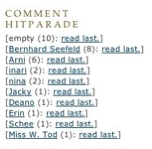
in addition i deleted the calendar in the sidebar. the calendar messed up the layout on windows-systems (thanks äbu) and i think no one will really miss it, because i want to incorporate some other mean of showing my blog-habits (hint to b. :-)
and i also cleaned out some bugs in the sidebar code while leaving some others. for example i cannot seem to get rid of those 40 or 50 pixels above the “me” on the top left, and just couldn’t make a line on the right side of the sidebar between the bar itself and the blog entries.
leave a comment if you find some bugs on your system or can help me with the two issues mentioned above!
update. the annoying 30-pixel-break is gone, it was just a simple misplacement of margin-top:30px vs. margin-bottom:30px (thanks arni!)


