Hier ein weiterer meiner Jahresrückblick 2015-Posts. Die anderen sind unter dem Tag jahresrückblick15 zu finden.
Weil das letzte Mal schon auf Englisch, hier grad wieder.
I’ve updated the RMarkdown-document of the “analysis” of my yearly Geodata a bit. Namely, I parametrized the shizzle out of it, switched to the freely available Stamen maps (based on OpenStreetMap data) and – something which I’m quite prowd of myself – implemented a function to automagically extract the name of a location based on its latitude and longitude from the GeoNames database.
The original file with the full code can be found either on GitHub or on RPubs, the result is pasted below.
Introduction
I tracked my location data with OpenPaths since the beginning of 2014.
OpenPaths comes as an application for your phone, which tracks its location, uploads it to the OpenPath servers.
You can then donate your data for scientific research and also look at the data yourself, which is what we do here.
To be able to do this, we grab a .CSV file with the location data.
Log in to OpenPaths, and click on CSV under Download my data, which gives you a comma separated list of your location data, which can then visualize with R, which is what we’ve done here.
Data
We want to plot the location points on a map, which we can do with the wonderful ggmap library.
To get the place names from the GeoNames Web Services, we need the RCurl library, to parse the output XML, we obviously need the XML library.
First, we load the data file and then remove all the datapoints where we have an altitudes of ‘0’ (which is probably a fluke in the GPS data)
Obviously, we only want to look at this years data, we thus save a subset of the dataset for further processing.
library(ggmap)
library(RCurl)
library(XML)
data <- read.csv("/Users/habi/Dev/R/openpaths_habi.csv")
data$alt[data$alt == 0] <- NA
whichyear <- 2015
thisyear <- subset(data, grepl(whichyear, data$date))
Since we’re going to use it often, we’re making a function to grab the name of a place based on its latitude and longitude.
geoname <- function(lat,lon){
  # Grab GeoNames XML from their API, according to location
  txt = getURL(paste0("http://api.geonames.org/findNearbyPostalCodes?lat=", lat, "&lng=", lon, "&username=habi", collabse = NULL), .encoding = 'UTF-8', .mapUnicode = TRUE)
  # Parse XML tree
  xmldata <- htmlTreeParse(txt, asText=TRUE)
  # Extract <name> node (with empirically found location)
  Name <- xmldata$children[[2]][[1]][[1]][[1]][[2]][[1]]
  # Since we're only using the name as string, we can return it as such
 return(unlist(Name)[[2]])
}
Then, we display a summary of the geographical points.
summary(thisyear$lat)
##    Min. 1st Qu.  Median    Mean 3rd Qu.    Max.
##   45.92   46.94   47.01   47.14   47.45   50.05
summary(thisyear$lon)
##    Min. 1st Qu.  Median    Mean 3rd Qu.    Max.
##   6.562   7.432   7.695   7.826   8.211   9.999
summary(thisyear$alt)
##    Min. 1st Qu.  Median    Mean 3rd Qu.    Max.    NA's
##   84.85  363.10  533.00  541.90  554.20 3400.00     228
In 2015 I was in the mean somewhere close to Auswil.
I’ve lived at 541.9 m AMSL in the mean.
The .csv file also contains information about the iPhone we’ve used to collect the data.
Let’s look at these.
summary(thisyear$device)
## iPhone4,1 iPhone6,2
##         0      8290
We see that in 2015 I have only used one phone, my iPhone 5S (iPhone6,2) and went through 9 different iOS version numbers.
summary(thisyear$os)
## 7.0.4 7.0.6   7.1 7.1.1 7.1.2   8.0 8.0.2   8.1 8.1.1 8.1.2 8.1.3   8.2
##     0     0     0     0     0     0     0     0     0   614   933   347
##   8.3   8.4   9.0   9.1   9.2 9.2.1
##  1653   374  1365  1808   997   199
If we assume that I’ve tracked my location consistently, then I’ve used iOS 9.1 the longest, with 1808 saved data points.
Location data
Extremes
Interesting points in my yearly location data:
- The minimal and maximal latitudes of 45.917 and 50.047, South and North respectively.
- the minimal and maximal longitudes of 6.562 to 9.999, East and West respectively.
- as well as the altitude, which ranges from 84.8 m AMSL to 3399.9 m AMSL.
We can get the extreme points out of the data pretty easily.
To do so, we subset the data depending on the value we want to have, construct a Location from these points, grab the map tile from that location, put a marker on top of it and display this is an image.
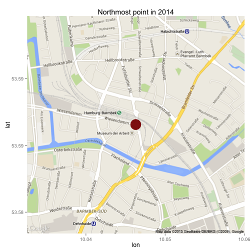
For the northmost point, this goes like so:
NLocation = c(lon=subset(thisyear, lat==max(thisyear$lat))$lon[1],
              lat=subset(thisyear, lat==max(thisyear$lat))$lat[1])
mapImage<- get_map(location= NLocation, source='stamen', maptype='toner-hybrid', zoom=10)
ggmap(mapImage) +
  geom_point(aes(x = subset(thisyear, lat==max(thisyear$lat))$lon[1],
                 y = subset(thisyear, lat==max(thisyear$lat))$lat[1]),
             alpha = .125,
             color="darkred",
             size = 10) +
  ggtitle(paste("Northmost point in", whichyear))
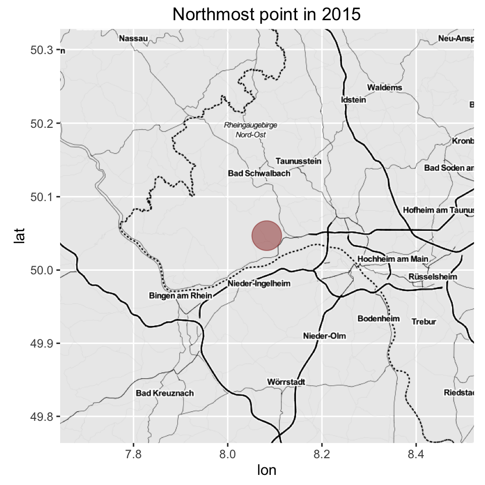
The northmost point in 2015 is in Kiedrich, which is true.
Even though I’ve not been in Kiedrich exactly, my mobile phone was probably connected to a tower there.
I spent two days in Ingelheim in January, at the International Masters competition in Swimming, which is close by.
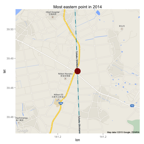
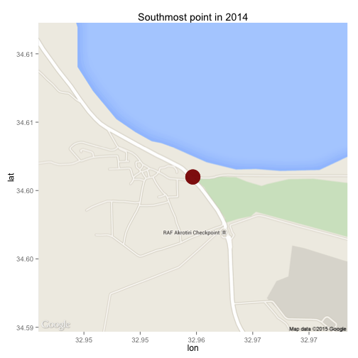
The rest of the extremes can be extracted accordingly.
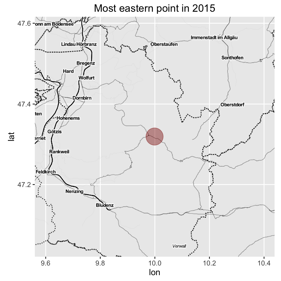
The most eastern point was in the Rehmen, during the first vacation with our (then) newborn daughter in the Bregenzer Wald.
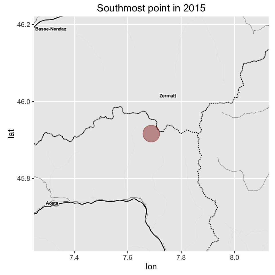
The most southern point was in Breuil, while skiing in Zermatt.
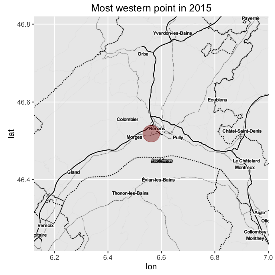
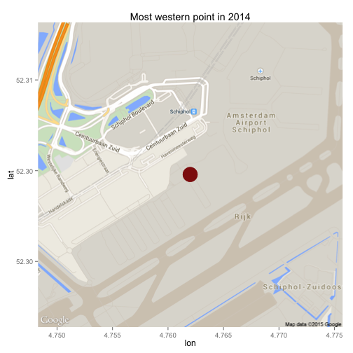
The most western point was in St-Sulpice VD, during a meeting at the EPFL in Lausanne for working on the GlobalDiagnostiX project.
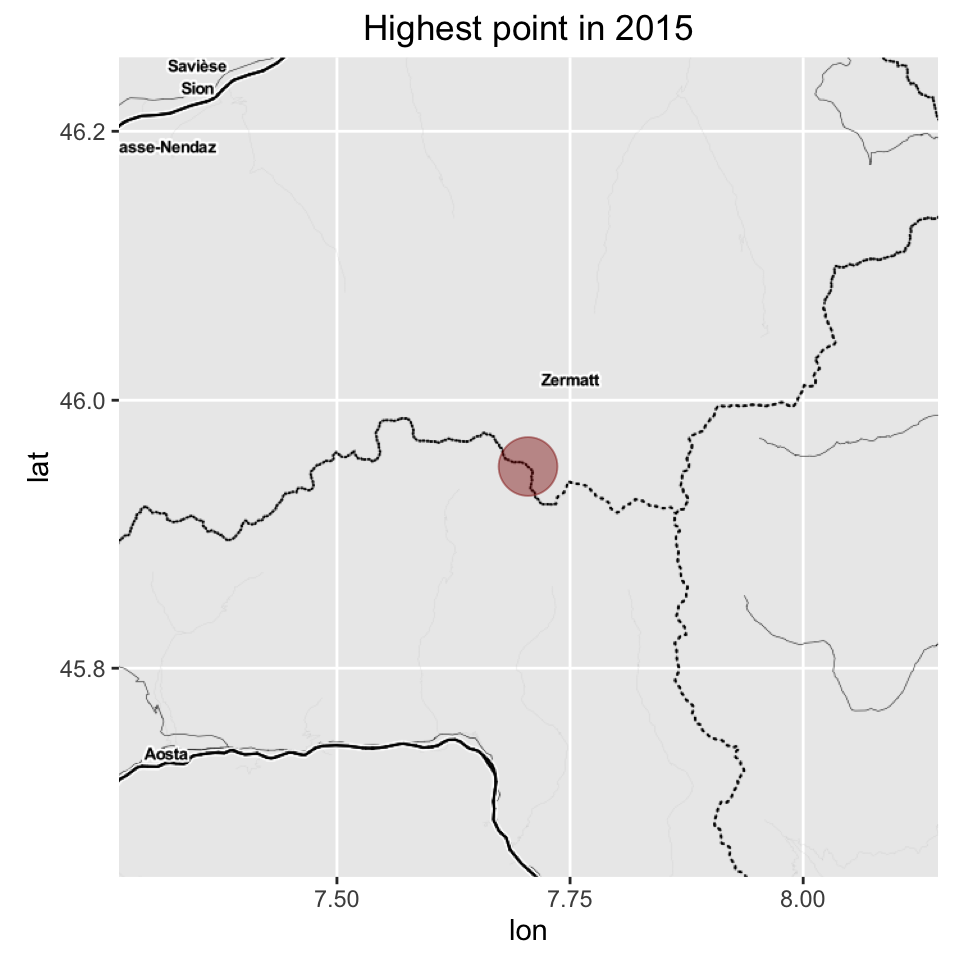
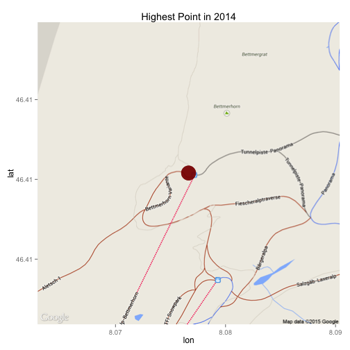
The highest point in 2015 at 3399.9 m AMSL was close to Zermatt on the Furgsattel.
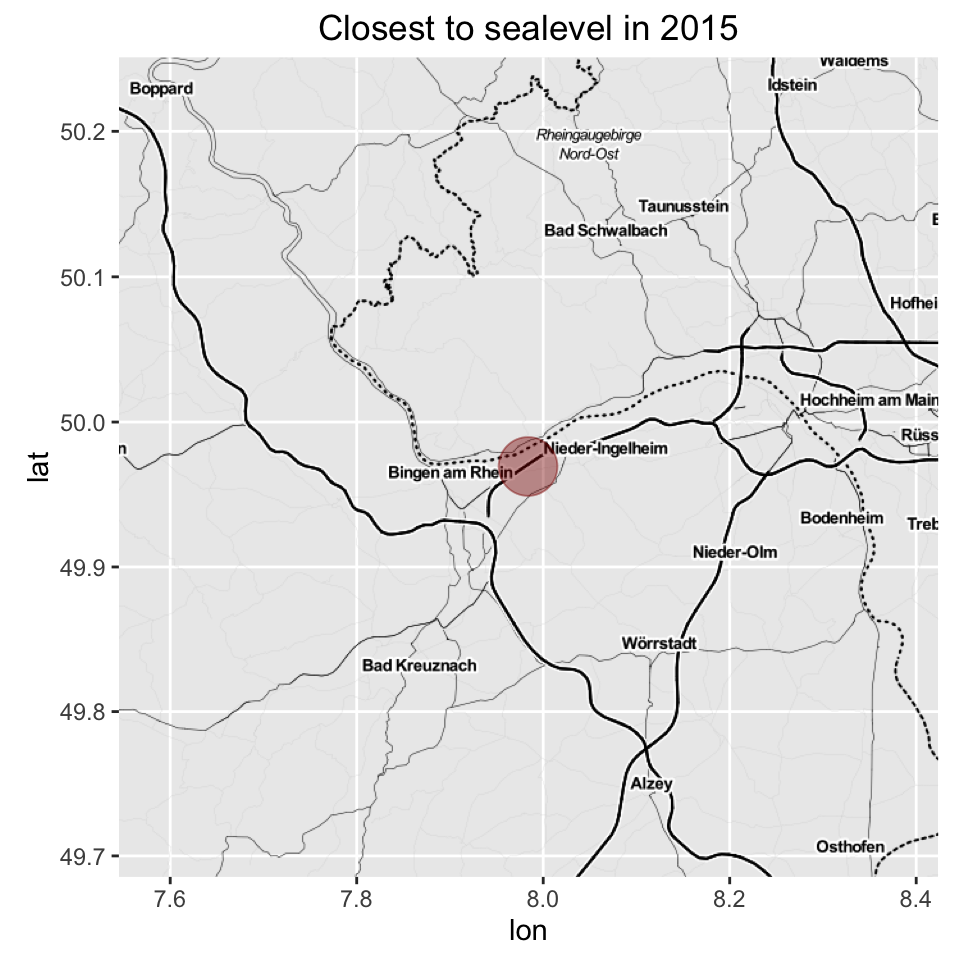
The lowest point at 84.8 m AMSL was in Gau-Algesheim, close to Ingelheim.
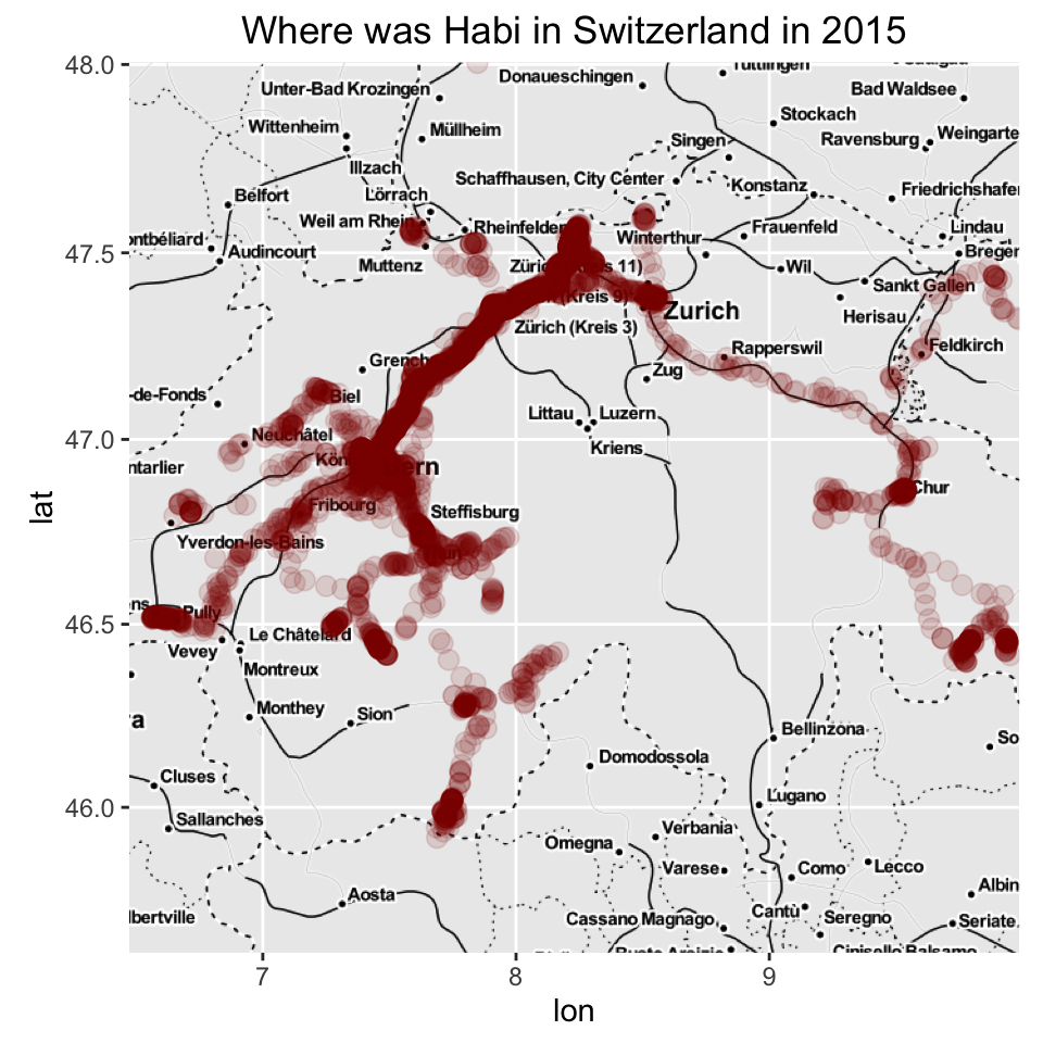
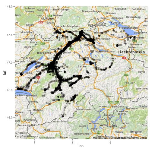
Where was I in Switzerland?
To plot the obtained data on a map, we have to center the resulting map location.
Since I only want to show the data points in Switzerland, we center the map on that.
Afterwards, we can simply plot all the thisyear geolocation points on top of that image, and you can see where I was in Switzerland in 2015.
HomeBase <- get_map(location= 'Switzerland', source = 'stamen', maptype='toner-hybrid', zoom=8)
AllPoints <- data.frame(lon=thisyear$lon, lat=thisyear$lat)
ggmap(HomeBase) + geom_point(aes(x = lon, y = lat),
                             data = AllPoints,
                             size = 3,
                             alpha = 0.125,
                             color="darkred") +
    ggtitle(paste("Where was Habi in Switzerland in", whichyear))