
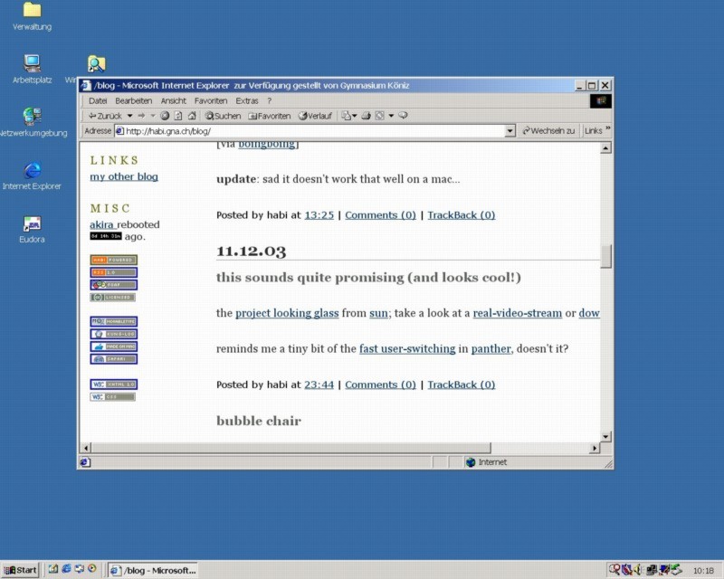
take a look at these screenshots:
| windows | os x |
|

|

|

|
|

|
why the hell did no–one tell me that my page looks shite with a windows-browser?
today i was at school and wanted to show someone a link i had posted somewhere here and then to my amazement habi.gna.ch lookes a bit like the “eyesore of the month” on a windows-machine.
well, it think there need to be tweaked quite a few bits and pieces in the css :-). and the sidebar (first set) looks quite ugly with these blue lines around the buttons, i think i should also change that, to prevent burnt retinas…
the funny thing is that the page looks nearly the same with safari, opera, camino and internet explorer on my machine, so who would have thought that it looks that different on windows.